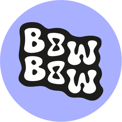
🎀 The story behind the logo – How the "Bow Bow" came about

A logo is more than just a pretty picture—it's an identity, a statement, and a little piece of heart. And that's exactly what this logo is.
The name "Bow Bow" was actually a spontaneous idea – short, catchy, double-edged, and of course, with a bow vibe. Bows aren't just decoration in cheerleading, they're a symbol. They represent team spirit, pride, solidarity – and, quite honestly, a bit of glitter, too. 😄 It sounds rhythmic, which fits the cheerleading theme very well.
It was clear from the beginning that the logo should convey exactly that: Cheer aesthetics, but clean.
The idea for the O's came while scribbling. The loops were supposed to be hidden in the lettering—so subtle that you'd have to look twice. So the two letter O's were used as a stage. Instead of simply leaving them round, they now contain small, stylized loops. A mini "aha!" moment for anyone who looks closely.
Different fonts were used, loop shapes were tried out, discarded, minimized, and simplified. The balance between playful and clean was important – as was recognizability.
The result is a logo that appears simple at first glance, but at second glance shows exactly what it's all about: attention to detail, reference to the cheerleading world, and a touch of humor.
By the way, Bow Bow is more than just a brand name – it's a little salute to the cheer community and a reminder that bows aren't just accessories, but a symbol of passion, performance and personality.
And that’s exactly what the shop should reflect.
